Whilst experimenting with all the different types of templates and styles for creating my website I found that some of the templates would only be suitable for specific types of websites, for example there is one template named '
- Some of the templates feature 'next' buttons which would be appropriate for a website for an Art gallery
-Other templates include lisits of related articles/hyperlinks underneath which is quite similar to websites, such as wikkapeadia or perhaps a search engine like GOOGLE.
Tuesday 30 November 2010
Friday 26 November 2010
working on the listings magazine and begging the website

I have decided that eventhough I am currently working on my double page spread of the listings magazine , that I am going to begin work on my website at the same time. I thought that beginning work on my website will give me more time to work on mastering how to use Macromedia Dreamweaver MX 2004 7.0, which will hopefully enable me to create a better prodcut than if I were to start making the website at a later date.
To get to terms with the dreamweaver programe I am experimenting with all the different styles of layouts and possibilities available. I think that if I figure out what all of the items mean on the Dreamweaver programme that I will have a better chance of creating a better website for the final product, whereas, if I don't take the time to learn how to use the programme I will end up creating a website that is not to the best of my ability.
To get to terms with the dreamweaver programe I am experimenting with all the different styles of layouts and possibilities available. I think that if I figure out what all of the items mean on the Dreamweaver programme that I will have a better chance of creating a better website for the final product, whereas, if I don't take the time to learn how to use the programme I will end up creating a website that is not to the best of my ability.
I need to see what I can achieve with the software available in order to achieve the best website I possibly can.
Tuesday 16 November 2010
Researching for the 2-page spread in a listings magazine:


From this chart that I found I been able to achieve knowledge of information that will help me to create a two-page spread for my listings magazine. I have found that the amount of listings per magazines ranges from 70-42, therefore I realise that my two page spread definitely needs to stand out. The amount of channels included is also incredibly high, which makes the competition for channels to stand out considerably higher and more competative.
- My spread will have to include a detailed description of what the TV channel is actually about, but it will need to be written in a way that sort of persuades people to watch it. It should make the reader want to watch the channel
- I should include a list of the range of programmes to be aired on the channel
- The spread shoulkd be aimed at my target audience in order to keep the information relevant"well educated, successful and dynamic people. Opinion leaders, high earners, trend setters" (Fashion TV)
- I could perhaps include a table of programme listings for the TV channel, that will inform people of what is going to be broadcast on the channel over the next week. In this case I will have to create a table with time slots and programmes that I will organise into specific time slots . For the best programmes I could include a brief synopsis on each, or alternatively I could pick a couple of programmes to elabourate on further, placing a photo from the programme with a brief piece of writting about it (very similar to a 'Pick of the Day' in newspaper TV Guides.

Thursday 11 November 2010
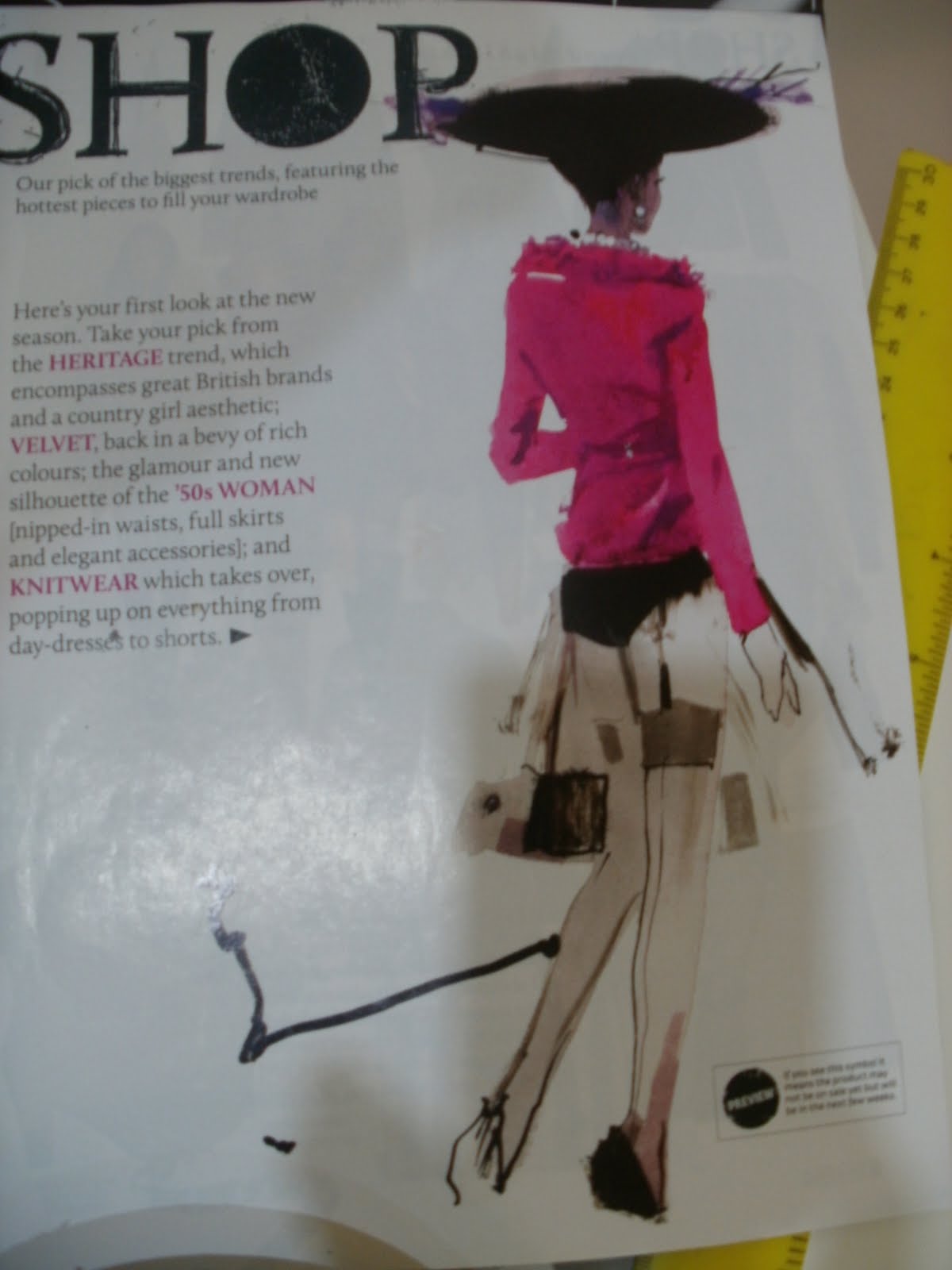
Evidence of illustration currently used in advertising:


Here I have collected some evidence in order to justify the fact that I have used an illustration for my advert, so I have collected diferent examples from reputable fashion websites and magazines in order to show that illustration is very much being used for advertising (and in fashion again).
The following written evidence has been sourced from:
History Of Fashion Illustration
By: Ryan Miller
The illustration of fashion through drawings, illustrations, paintings is referred as Fashion Illustrations. Fashion Illustration is usually, closely associated with the reproduction of fashion in the magazines, for the promotion and advertisement of the fashion designers, stores and boutiques.
Tuesday 9 November 2010
Newspaper advertisement

This is now my final FINAL newspaper advertisement design for my Fashion TV channel. I have slightly changed the font for the basic information and I have changed the start date of the channel as well so that it fits with all of my other documents with start dates on, such as my 2-page spread for a listings magazine.
I am aware that I have previously spoke quite extensively about using a particular font for the I HEART logo, however whilst completing my website I experimented with fonts once again and came up with this particular font that I think looks a lot more sophisticated. I have also decided to omitt the small heart above the I, which I think also helps it look more effective.
Thursday 4 November 2010

Wednesday 3 November 2010


Newspaper advertisement proposals


- Here are some of the design proposals for my newspaper advertisement to advertise my fashion TV channel. I experimented with different types of formats, fonts and colours in order to create different advertisements. On some of the advert proposals above I have included my own font, that I drew along with the sketch then photographed it and uploaded it onto the computer. However I don't think that this font looks very effective and I ahve decided against using it again. I have used the same font for all the information throughout, after experimenting with a few different styles of font I decided to use this particular font as I think it looks simple, yet professional and it is easy to read as well which helps a lot.
- I think that the design proposals without colour and shapes look better than the colourful proposals, as I think that the colour added with the shape of a heart looks a little tacky and messy. However, newspaper adverts will attract much more attention when colours are used, but it would be cheaper in a business situation to use no colours, but in the long run it may prove to cost more as using colour, means more attention and more attention means more money for the company.
- I like the first proposal best, because I think it looks sophisticated and the splash of colour used for the font adds an eye catching detail.
Subscribe to:
Posts (Atom)