Monday 13 December 2010

Using Adobe illustrator perhaps to improve my illustration

-Stylise glowing edges effect. This type of effect would probably be more suitable for a halloween image, or perhaps even an image for halloween instead of a fashion magazine.


-Diffuse glow in the effects gallery. I quite like this effect, as I think adds a different appearance to the illustration.


Today whilst looking at an example of a media coursework blog I discovered that someone had used adobe illustrator to design their magazine cover. Then once I had seen this I immediately thought that I could of used this for my newspaper advert /illustrated logo image. So I decided to open adobe illustrator CS4 and then I opened my hand illustrated image and experimented with the software to see if I could improve on the design at all. Here I have included some examples of what different possibilities I could use.
For the website I understand that I need to include a minimum of three hyperlinked pages, but in my website I have included a possible 7 hyperlinked pages. I have realised there are some categories that I will find hard to make look realistic, due to the fact that I will need to take extremely realistic photos. In order to progress further in my website at the moment I feel that I need to narrow my selection down now and choose three or four out of the 7 hyperlinks to decide on.
  • For the Beauty page I don't think it would be too hard to make images look realistic. I could take photo's of people eyes with different styles of make-up to create different online tutorials of how to recreate a certain look
  • Fashion week: I think that this would be fairly difficult to make it appear realistic, due to the fact that the photographs that I would need to attend an actual fashion event like London Fashion Week to capture the right footage and images . The fashion week page would also need to feature all collections ahead of the current season, so if it was winter for instance the s/s collections for the next year would need to be on display. From my research I know that websites such as ELLE and VOGUE mostly include images taken on the catwalk and I think that to get these types of pictures i will need to organise an a catwalk event,l something that given with the time provided and the minimal budget I have is more or less impossible. Therefore I have decided that it will probably be best if I don't include this page as one of my hyperlinked pages.
  • Events: Similarly to the fashion week page the events page would need to include images from fashion events and some general events, however, these events are exclusive and I would not be able to access one to get photos.
  • Designers: Fashion websites usually include look books of all current and previous collections from each designer in a database / list . I think this page could work as long as I chose original images that are appropriate. I could also include some quirky details such as famous quotes by specific designers e.g. "Fashion fades, only style remains the same."

Friday 10 December 2010

--Pinhole setting
---fish eye image

Whilst taking photographs of the jewellery I experimented with many different effects on my camera, some of which I didn't even know existed. These techniques included a fish eye setting,pinhole setting ( which highlights a specific part of the photograph with a spotlight), sketching setting.

fish eye setting : I think that this is definitely a good setting, however, I think that for a series of jewellery photographs that the fish eye setting would not be appropriate due to the fact that the generally in jewellery photos the jewellery needs to be displayed in a clear way, so that it is easily viewed by potential customers. I think that in a series of photographs that perhaps one fish eye shot would look appropriate as long as the jewellery included within the shot was in another photograph so that it could be clearly seen.

Pinhole setting: I have experimented with this setting and I liked the way that it can illuminate the jewellery. I positioned the jewellery with the pieces that I wanted to highlight the most situated in the middle, then when I captured the shot the jewellery became highlighted in the middle with the colour fading out towards the ends/edges of the photo. I think this effect was good for making specific pieces of jewellery stand out to the customer.

The sketching setting: I tried the sketching setting on the camera, however I am not planning on using this due to the fact that the contrast and brightness is so different that you cannot even see the main outlines/ forms of the jewellery.

Wednesday 8 December 2010

Jewellery photoshoot update:

For the jewellery shoot I used :
White-painted vintage style birdcage
An assortment of vintage-style jewellery
A white wall (for the white backdrop)
A bright desk lamp (for the lighting)


Firstly I searched through all the jewellery in my house and gathered all the vintage style jewellery together. I hung pieces from the different parts of the birdcage and arranged it accordingly to my artistic vision. I then placed the birdcage in front of a white wall in my house and experimented with different types of lighting using normal lighting from my house and lighting using the desk lamp.

Possible props for my series of jewellery photos:


  • One possible idea that I have is to use a old vintage looking birdcage to use as a prop to hang jewellery on. I could either juxtapose the vintage style cage with a different style of jewellery, so perhaps exotic looking jewellery, or alternatively I could go along with a particular theme and pair delicate vintage jewellery with the vintage looking birdcage. For this type of shot I think it would look effective to have a plain white backdrop and perhaps a spotlight shinning onto the jewellery to make it glisten in the light.
  • I think that I will try the two ideas and see which appears best in photos. Then if I think some of the photos are good enough I will then either edit them on the computer or use photoshop if I want to get a specific effect.


Monday 6 December 2010

Ideas for producing original images for my fashion channel website


Due top the fact that I have to include origninal images I have found it difficult of things to take photos of that will suitable for a fashion TV channel. I looked at fashion magazines for inspiration on different types of photos/images that I could include and I was drawn to images of jewellery shot in many different, often unexpected ways. For instance in a December addition of VOGUE a whole wintery scene had been created from newspaper by an artist and then the jewellery was selected on a theme and placed imaginatively into the setting. I really liked this idea in particular, because I think the way the jewellery was shot was really unique and different to anything I had seen before. I think that if I were able to achieve photographs even remotely like these photographs, that it would provide an excellent opportunity for me to demonstrate some photography skills and these sorts of images would be really ideal for the fashion channel.

I also found other inspiring images such as:


  • vintage style watches that were photographed in pretty floral vintage style tea cups / tea sets, jewellery with different brightly coloured backgrounds.

  • One that I particularly liked was a photographs of jewellery that was placed with a separate background of the jewellery taken quickly so it forms a blurry shot that captures all sparkling pieces of light. I thought that I would quite like to create something like this, however I think to create a series of photographs like this and make them look classy would be very difficult as the blurred backdrop could appear a little tacky.

  • Although this image from the Asos magazine is not of jewellery, I liked the way that the photograph is very simple, yet effective. I thought it was interesting that the photographer thought that the clothes would look very effective on their own and didn't require a model to be photographed wearing them. I also like the use of unusual props, such as a an old antique screen and an old battered briefcase and I think that rather than distract from the clothes. The props help to sort of achieve a mise-en scene in a way, as the props all add to the vintage appearance of the clothes.

Tuesday 30 November 2010

Whilst experimenting with all the different types of templates and styles for creating my website I found that some of the templates would only be suitable for specific types of websites, for example there is one template named '


- Some of the templates feature 'next' buttons which would be appropriate for a website for an Art gallery

-Other templates include lisits of related articles/hyperlinks underneath which is quite similar to websites, such as wikkapeadia or perhaps a search engine like GOOGLE.

Friday 26 November 2010

working on the listings magazine and begging the website


I have decided that eventhough I am currently working on my double page spread of the listings magazine , that I am going to begin work on my website at the same time. I thought that beginning work on my website will give me more time to work on mastering how to use Macromedia Dreamweaver MX 2004 7.0, which will hopefully enable me to create a better prodcut than if I were to start making the website at a later date.

To get to terms with the dreamweaver programe I am experimenting with all the different styles of layouts and possibilities available. I think that if I figure out what all of the items mean on the Dreamweaver programme that I will have a better chance of creating a better website for the final product, whereas, if I don't take the time to learn how to use the programme I will end up creating a website that is not to the best of my ability.


I need to see what I can achieve with the software available in order to achieve the best website I possibly can.


Tuesday 16 November 2010

Researching for the 2-page spread in a listings magazine:

From this chart that I found I been able to achieve knowledge of information that will help me to create a two-page spread for my listings magazine. I have found that the amount of listings per magazines ranges from 70-42, therefore I realise that my two page spread definitely needs to stand out. The amount of channels included is also incredibly high, which makes the competition for channels to stand out considerably higher and more competative.

  • My spread will have to include a detailed description of what the TV channel is actually about, but it will need to be written in a way that sort of persuades people to watch it. It should make the reader want to watch the channel

  • I should include a list of the range of programmes to be aired on the channel

  • The spread shoulkd be aimed at my target audience in order to keep the information relevant"well educated, successful and dynamic people. Opinion leaders, high earners, trend setters" (Fashion TV)

  • I could perhaps include a table of programme listings for the TV channel, that will inform people of what is going to be broadcast on the channel over the next week. In this case I will have to create a table with time slots and programmes that I will organise into specific time slots . For the best programmes I could include a brief synopsis on each, or alternatively I could pick a couple of programmes to elabourate on further, placing a photo from the programme with a brief piece of writting about it (very similar to a 'Pick of the Day' in newspaper TV Guides.


Thursday 11 November 2010

Evidence of illustration currently used in advertising:


Here I have collected some evidence in order to justify the fact that I have used an illustration for my advert, so I have collected diferent examples from reputable fashion websites and magazines in order to show that illustration is very much being used for advertising (and in fashion again).


The following written evidence has been sourced from:


History Of Fashion Illustration

By: Ryan Miller


The illustration of fashion through drawings, illustrations, paintings is referred as Fashion Illustrations. Fashion Illustration is usually, closely associated with the reproduction of fashion in the magazines, for the promotion and advertisement of the fashion designers, stores and boutiques.

Tuesday 9 November 2010

Newspaper advertisement


This is now my final FINAL newspaper advertisement design for my Fashion TV channel. I have slightly changed the font for the basic information and I have changed the start date of the channel as well so that it fits with all of my other documents with start dates on, such as my 2-page spread for a listings magazine.
I am aware that I have previously spoke quite extensively about using a particular font for the I HEART logo, however whilst completing my website I experimented with fonts once again and came up with this particular font that I think looks a lot more sophisticated. I have also decided to omitt the small heart above the I, which I think also helps it look more effective.

Thursday 4 November 2010


This is the final font that I have chose, I decided to use a fairly simplistic font, because I think that this looks more professional than having a

Wednesday 3 November 2010

Illustration possibilities for my newspaper advertisement:


Newspaper advertisement proposals


  • Here are some of the design proposals for my newspaper advertisement to advertise my fashion TV channel. I experimented with different types of formats, fonts and colours in order to create different advertisements. On some of the advert proposals above I have included my own font, that I drew along with the sketch then photographed it and uploaded it onto the computer. However I don't think that this font looks very effective and I ahve decided against using it again. I have used the same font for all the information throughout, after experimenting with a few different styles of font I decided to use this particular font as I think it looks simple, yet professional and it is easy to read as well which helps a lot.
  • I think that the design proposals without colour and shapes look better than the colourful proposals, as I think that the colour added with the shape of a heart looks a little tacky and messy. However, newspaper adverts will attract much more attention when colours are used, but it would be cheaper in a business situation to use no colours, but in the long run it may prove to cost more as using colour, means more attention and more attention means more money for the company.
  • I like the first proposal best, because I think it looks sophisticated and the splash of colour used for the font adds an eye catching detail.

Sunday 31 October 2010

Fashion Illustration


Above are some examples of fashion illustration that I have researched, including illustrations by famous illustrators David Downton an Danny Robberts who have produced works for the top fashion magazines such as


Whilst starting my newspaper advert I figured that I would need to take photographs, instead of using photos that already exist. After much debating I thought of many different ideas of what to take photos of, but I came to the conclusion that anyone that I would need to take photos of for my fashion channel would have to be a model, because obviously to advertise a fashion channel the people would need to look appropriate and have the right look etc.
  • Then I had an idea of using fashion illustration as the photo resource for my fashion channel advert. As i remembered that lots of fashion magazines and sometimes fashion blogs use fashion drawings/illustrations to advertise things.
  • So then I had to decide on what style of fashion illustration to create, I drew out a couple of different formats and ideas. I then looked through all my collections and old online archives of VOGUE and ELLE to gain inspiration. I then found a photograph from a designer campaign of a model with a hat and glasses on and I thought I should sketch it out to see what it looked like as I thought it was the sort of image that would appear timeless.
  • I then drew the image in pencil first, then I went over the outline in a black Biro to add more definition. I then took lots of different photographs of this drawing, so that I could transfer it onto the computer. Once it was on the computer, as I do not have photoshop at home I pasted one of the photographs that I liked onto Microsoft Word 2007. Then I used the picture editing toolbar to change and enhance my illustration; I experimented with many different formats.
  • In Microsoft 2007 there are also many different things when you can change the shape of the photograph and make it 3-D or create shadows of the image. I decided to make the illustration very bright and add some contrast in order to make it appear more defined. However the more contrast that I used the more definition was lost, this was probably due to the fact that the sketch was transfered to the computer by a camera, thus it was quite faint to start with.


Friday 15 October 2010

Creating a newspaper advert for the channel:

One of my preliminary tasks is to create a newspaper article to advertise my fashion TV channel 'i heart'

When designing my advertisement I need to decide whether the newspaper is going to be printed in black and white only, or colour. Either choice will make a big impact on the overall appearance and effectiveness of the advert; if the advert is in colour it will easily capture people's attention, whereas if the advert is in black and white then then it will be harder, thus I will need to use better images and words in attempt to capture attention.

When I typed in fashion magazine advertisements into google, it only appeared with advertisements and campaigns for designers like this for instance :


I then typed in fashion channel advertisements, but nothing really appeared either. After much research I have acknowledged that from record there are no fashion TV advertisement that exist from a newspaper article. However instead of just simply not create a newspaper advertisement because of this reason I will still create one as I think that if the advertisement is placed in the right newspapers and roughly placed around the fashion/lifestyle part of the paper then it will effectively attract the correct attention and it will be worthwhile.

Now I need to decide on a type of image to include for the newspaper, I have decided that i could either combine images with fashion orientated sketches: or I could use fashion images that have been used before to create a montage of images, I could make a montage of fashion orientated images that have all been taken by me, or alternatively I could just merely use a logo on it's own perhaps with a caption or catch phrase.

If i use images I think that I need to use images that clearly address what the fashion channel is about, for instance because I am including a beauty section I will need to use photo's that suggest that my fashion channel is not just merely about fashion, but a whole range of fashion orientated things.


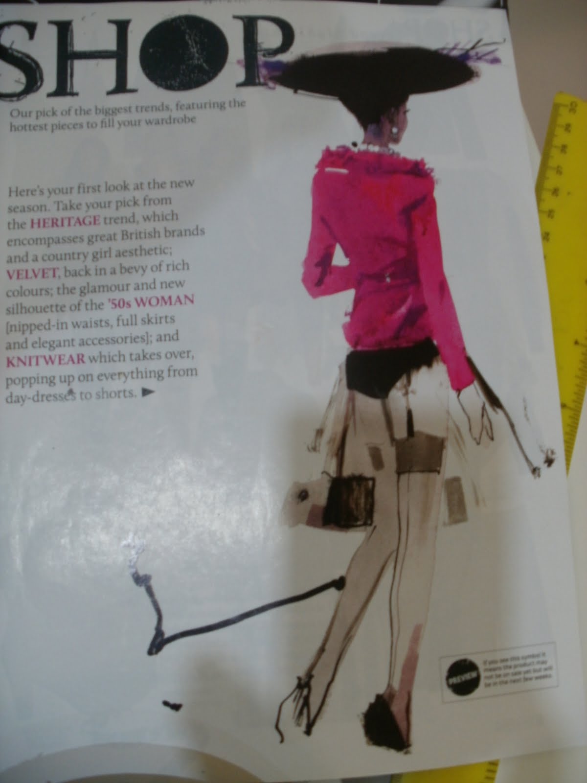
Here is a collection of images that I have gathered that I found inspiring:


From these images I am inspired by the images, the formats and just the appearance of the mood boards in general.
  • I will also need to think of a catch phrase/ satement or short caption to place in the advert, as I don't think that it will be very effective if images are only used.
  • I also need to decide on a size for the advertisement, if it takes up a whole page I think that it will definitely attract much more attention, whereas, if it only takes up a small amount of the page it will not be worth placing it in a newspaper, because it won't attract any attention.
  • I also need to decide on what software will be the best to make an effective advertisement.

I think that I will create an advertisement that will at least take up 1/4 of an A4 newsaper page, this will ensure that the newspaper article will attract the attention of people reading the paper.