Wednesday 6 April 2011


Q2


Q3


 Overall I have learnt from the opinions and feedback that both my main product and my ancillary texts are appear relatively professional (they could pass as real media products). I have also acknowledged that if I were to complete these tasks again I would use more images associated with fashion, for instance I would create photo shoots where I would have people dressed in the latest trends etc. I would also try and take images from actual fashion events, such as London fashion week; I think this would definitely help make my products appear more successful and much more professional.
Evaluation Q1


Friday 18 February 2011
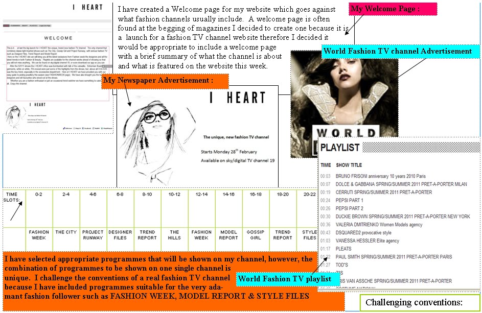
Final Website : (Moonfruit site) I HEART
Thursday 17 February 2011
My actual Website


(Please note that in order to display each page on this blog I had to upload each image by print screening parts of them cropping them in a word document, then finally pasting them in paint and saving them as JPEG's therefore they are not really clear or completely exact examples of what is shown on my website).
Monday 7 February 2011
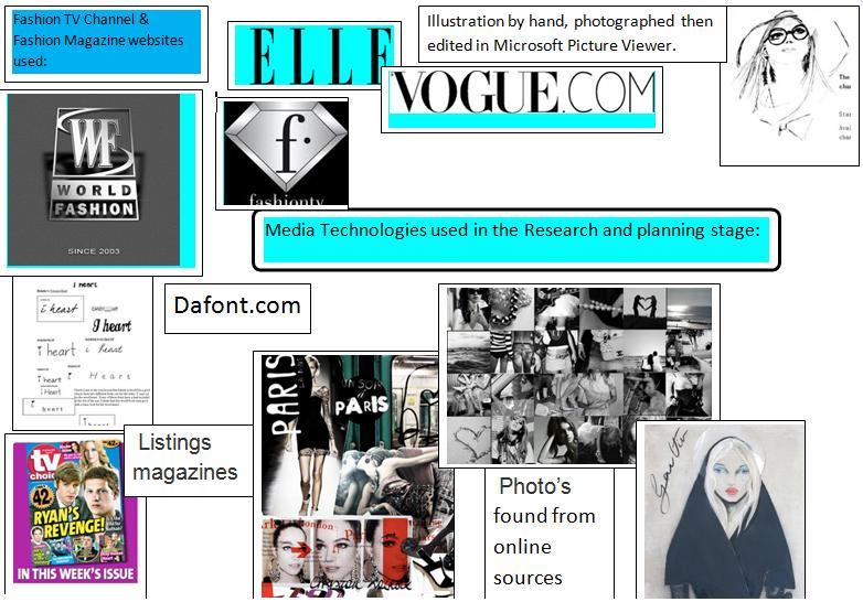
Images that I have not taken myself:


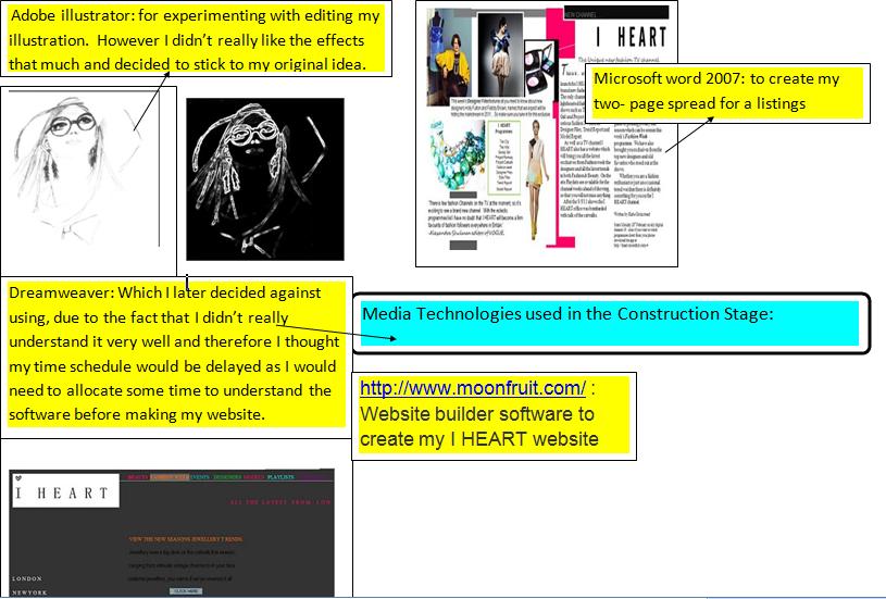
I realise that part of the task that I have choosen is to only use original images, video and audio extract. But as I am creating a website for a fashion TV channel, I have struggled with finiding ways to produce images, that are appropraite for the pages such as DESIGNERS, FASHION WEEK e.t.c. As these two particular pages are very difficult to take photo's for, most obviously because I do not have any access to actual Designer's so I cannot take portraits of them or their collections (a task which would literally be impossible). FASHION WEEK is also an extremely difficult topic to take photos for, due to the fact that again I do not have access to fashion week, therefore to resolve this I have decided to take jewellery photo's for the fashion week page, which I have accompanied with some text claiming that they are the new trends from the s/S'11 Shows. I have not found a way to combat the Designer photo problem without using existing images, so I have used four photographs of either the designer's themselves, their work or their shows. I have only used these images for the new talent section of my site. I did think about also using images from the internet for the established designer page, however I decided against this as I didn't want to get lots of marks deducted for using too many images that are not original.
Friday 4 February 2011
Changes in the design of my website


Wednesday 2 February 2011
Listings Magazine

-1st page


- 2nd Page

This is my final Design for my 2-page spread focusing on the channels launch (for a listings magazine). I have displayed it fully below, however due to the image size restrictions on blogger I have had to printscreen and save smaller sections of the pages so that the writting can be read easily on this blog.
The writting that I have used for the main bulk of the article is also what I have wrote on my Welcome page for my channel, however I have altered the words slightly so it is more suitable for the channels launch.
- I have also included a small list of all the programmes to be shown on the channel
- A small piece of information about the designer files programme
- And a quote that I made up by Alexandra Shulman (editor of British Vogue)
 I have kept the colours true to the ones that I have used on my website: fuscia pink, mid grey, black and white. I have also included images that I have included on my website, which I think is a good idea as then all of my media work looks slightly similar and linked together.
Tuesday 1 February 2011
Website software changes:
My former website made on Dreamweaver


Monday 31 January 2011
This week:
My aim for the end of this week is to finish the two page spread for the listings magazine and to get at least half way through completing my website for the TV channel. I think that I really need to complete these aims otherwise I am going get very behind, therefore putting me in danger of not completing the the project on time.
Friday 21 January 2011
Schedule update:
- I have now completed the newspaper advertisement
- I have made a start on the two page spread for a listings magazine
- I am in the process of creating my website
Newspaper Advertisement: I just need to check the newspaper advertisement and then upload it onto my blog under the name of final newspaper advertisement.
Two page spread for a listings magazine: I need to finish this off by completing the text and adding the images, then I will proof read it check it and finally print screen it or save it as a picture then upload it onto here
Website for the TV channel with minimum of 3 hyperlinked pages: I currently have three different hyperlinked pages, all of which are unfinished. I have sorted out the layout, logos and links e.t.c, however, I now need to add original images and text.
Tuesday 18 January 2011
Beauty/Make-up Photo Shoot:
 These photo's are the final selection that from the photo's that i took for my Beauty/make-up shoot. In order to create a professional appearance I took note of how make-up is shot professionally on a clear background. At first I did not know whether to use a sheets of white paper to create this effect, but then I had an idea to use a plain art canvas (which still had the plastic wrapping on it). The canvas proved a good choice for the shoot and the plastic wrapping has provided a suitable surface for shooting the products on. I think that it also helped that I have used the lighting from my bedroom, which is very bright as I have lights which are similar to that found in shops. I've also adjusted the brightness and contrast of all these images to create a really bright, clean finish on them. Overall I am very happy with the end result and I definitely think that these photographs are the best out of all the shoots that I have taken, so hopefully they will compensate for some of my more amature photographs.
For the shoot I used :
An small square art canvas (with plastic cover on)
Chanel Blusher wheel compact
YSL Eyeshaddow duo compact
YSL Parisienne Perfume
Dior Pure Poison Perfume
and a small selection of Bobbi Brown Make-up Brushes.


Saturday 15 January 2011
Potential photographs for my website:
 Although I liked the idea of this photograph with the two makeup compacts facing each other I figured that when I took the photo that I woukld need to take it in a room with nothing else in as the shine on the cases reflects the room around them ( which does not look very professional).
 In this photograph I had a similar problem to the previous one as the compact case shows reflections that makes it appear unproffessional, therfore I will not be using this photograph in my website.
 I took this photograph by chance and then I edited the contrast and lighting differences on when I uploaded it onto my computer. i really like the misted effect that I have managed to achieve, however, although I like the image I don't think it will fit anywhere onto my website.

 These three images are from the 'Spring Vintage' jewellery shoot that I did. They are just some of the examples of when I tested different settings on the my camera. For these particular images i have used the sketching setting on the camera, which creates the appearance, not of a photograph, but of the image being sketched. Eventhough I do like this technique I feel that these images will; not be suitable for the purpose that i am using them for; because they are for a jewellery shoot on my website, the sketching effect sort of defeats the object of the shoot as the purpose is to try and showcase the jewellery or selling it.

 For these three images I have used the 'magic' setting on the camera, which accentuates colours making all colours appear quite exuberant and vivid. I also took these photographs using a white curtain as a backdrop, which I think makes the phots look a lot more proffessional. I will definitely consider using atleast one of these three images on my website.
 On this photo I have used the pinhole setting on my camera which has created an illuminating effect on the birdcage which I think looks very effective. The only trouble with this image is that there is a fold in the curtain which is very close to the birdcage, therefore even if I crop the image the side of the birdcage may appear a little distorted and odd with barely any backdrop.
 This is also another example of when I used the pinhole setting on the camera I like the idea that this shot is a close up, so the jewellery is fully showcased, however, I don't think it's the best image that I have took, therefore I don't think i will be using it on my site.
 These two images are using the 'fisheye' setting on my camera. I think that this effect has definitely created an unusual perception of the jewellery, however, I think for the purpose that Iam using the images for it could appear a little sloppy and too amature looking.
 In this image I was experimenting with different backdrops for the shoot. Here I have used a white currtain and a mirror to reflect the birdcage. I think that the yellow wall sort of spoils the image though, as the colour dettracts from the jewellery.
 I really dislike this image and I definitely will not use it, as I think the use of lighting , the backdrop and the distance that the photo is taken from appears really tacky and messy.
 I more-or-less think the same about this image as the one above and I will not be using it for the same reasons.
 This image was for my 'Sea of Blue' jewellery shoot, however, I have decided against using it as I feel it looks messy and to like I have took the photographs, which I have.
 I have actually took this photo using the fisheye setting on the camera, then I have changed the contrast and brightness on my computer at home. I think that the effect of this image looks quite proffessional and I will therefore be using it on my website.
  I also really like this image which I have used the 'magic' setting on the camera, which has accentuated the colours displayed. I then edited the contrast and brightness using my computer and as with all the images that I toom I have cropped the image accordingly.
 As the theme of this shoot was 'Sea's of Blue' I have tried to play up to this theme in this photograph by arranging the jewellery to look like a boat on the sea. Although I think the principle of the idea was effective, i do not think that the end result i8s very proffessional, therefore I will not use this image. I do howver, think that this idea would work very well if it was on a professional shoot and an unlimited supply of jewellery and equipment could be provided.
 This is another shot for the 'Sea's of Blue' shoot that I think has worked very well, for this image I have used the pinhole setting on my camera which has really worked well illuminating and highlighting the jewellery. I also think that it helps that I have used some bedding as a plain white background, as opposed to the light blue tissue paper that I used for the boat photographs.


